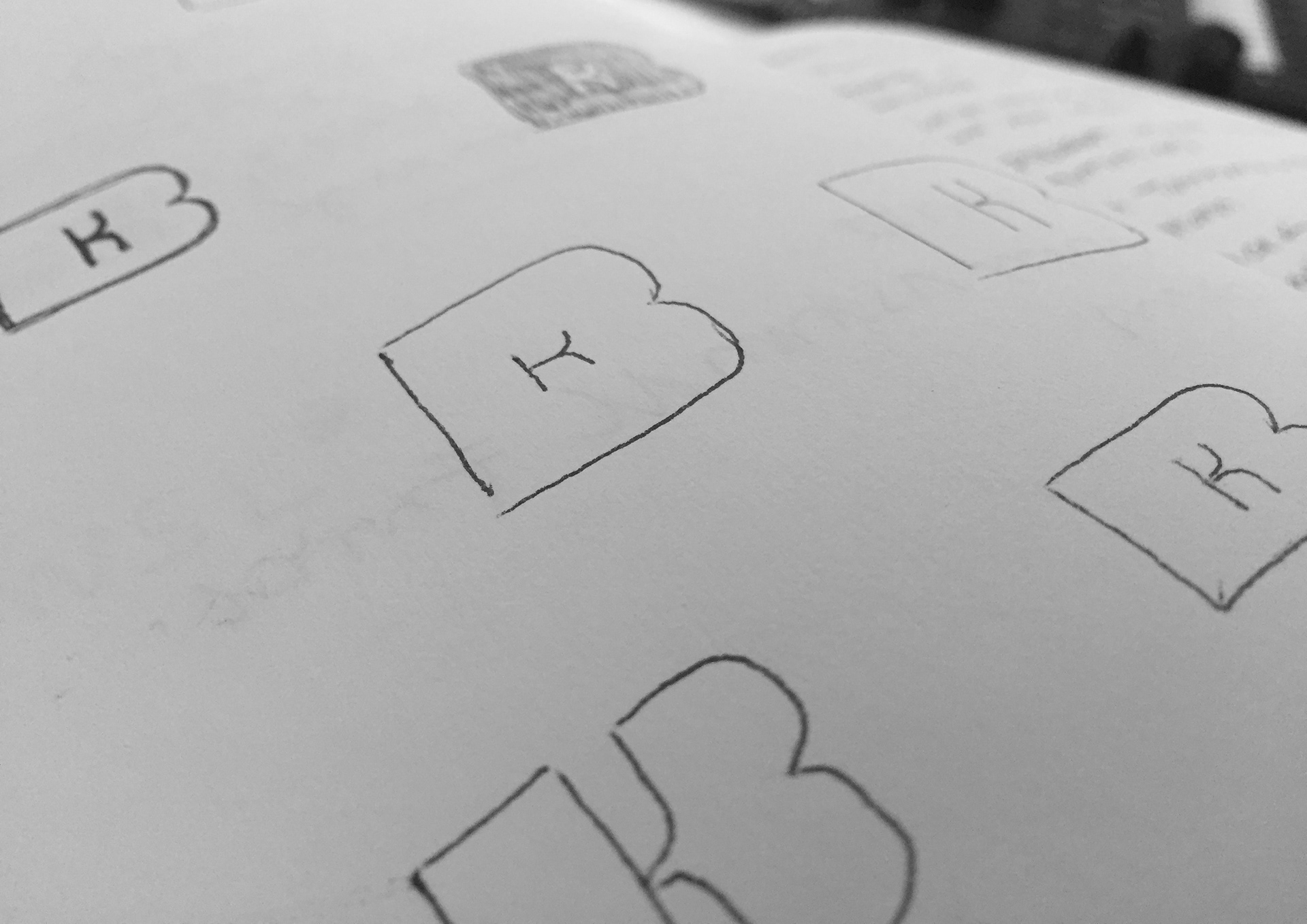
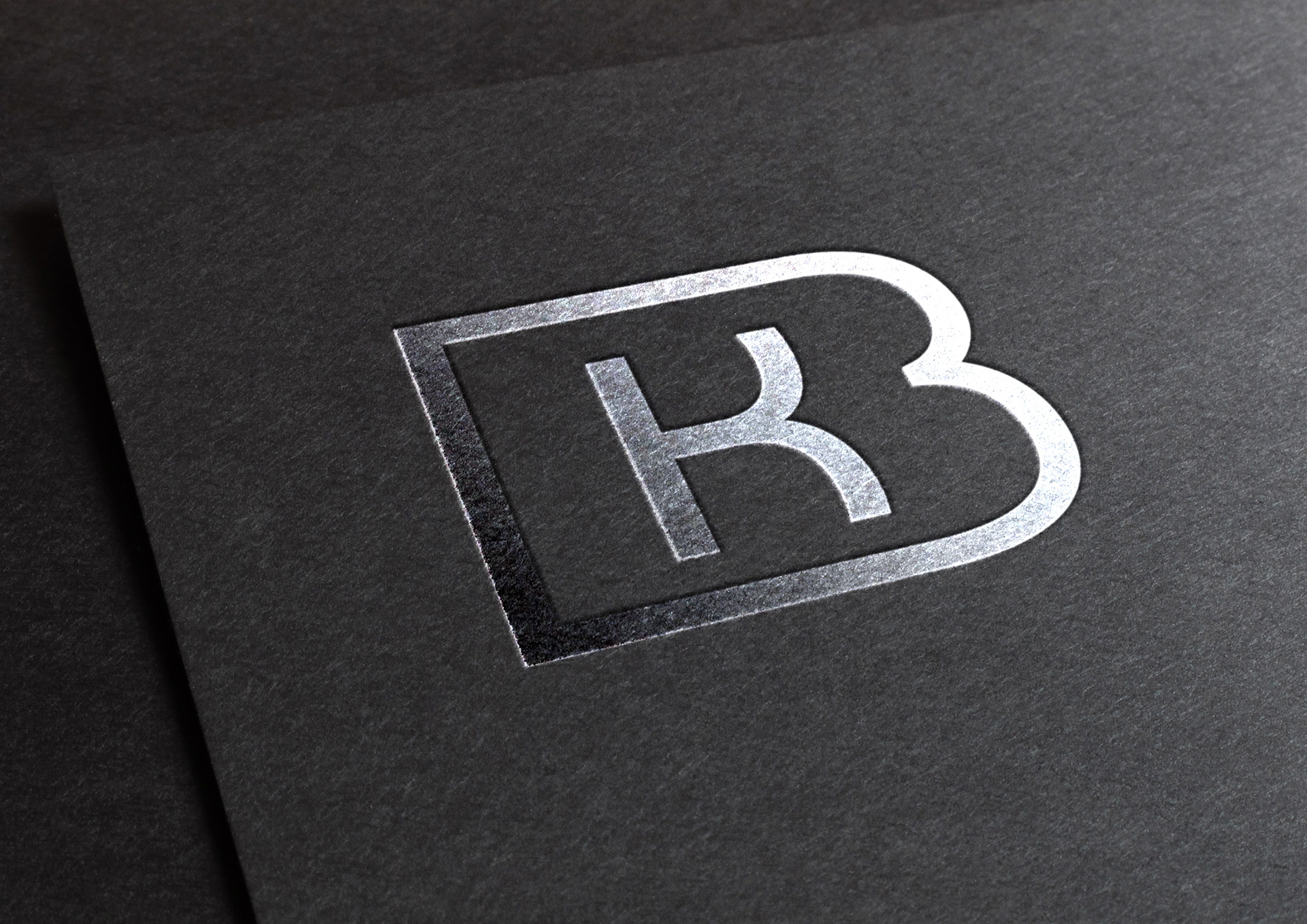
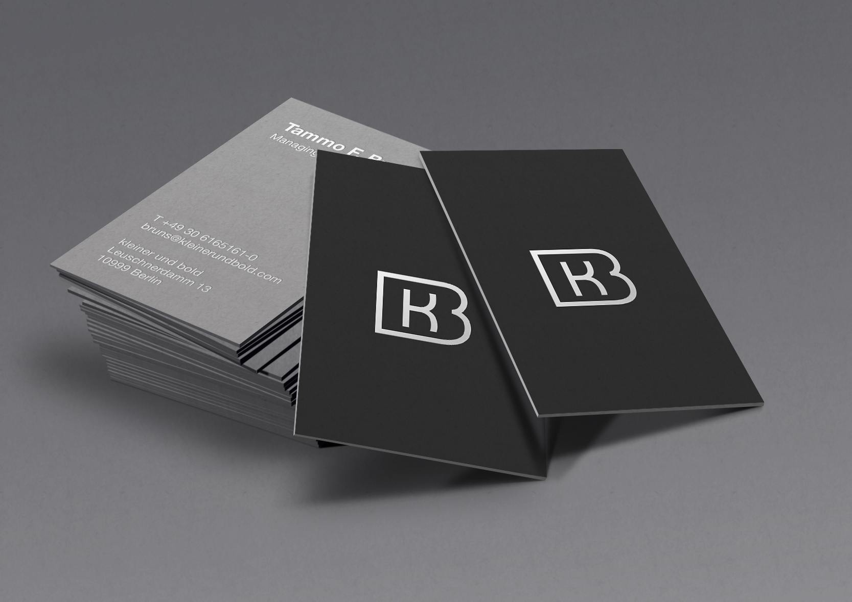
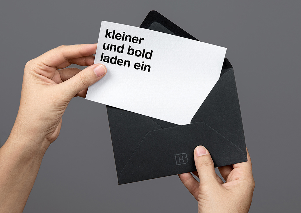
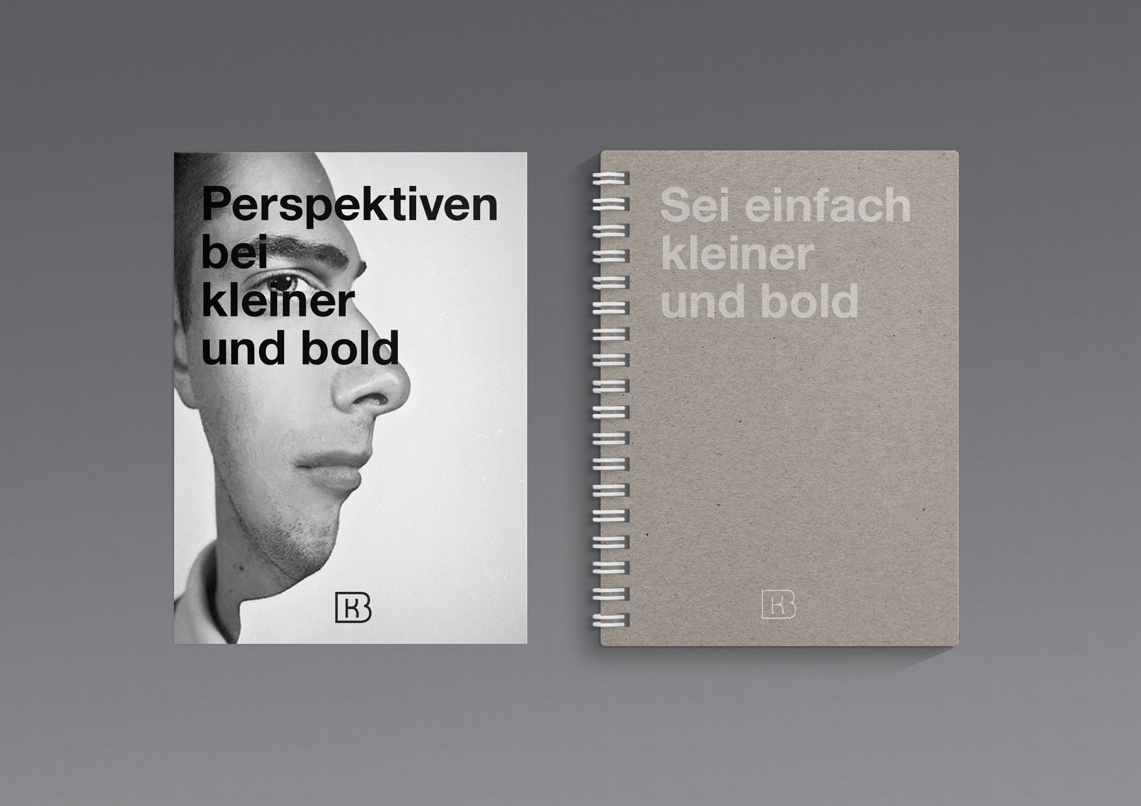
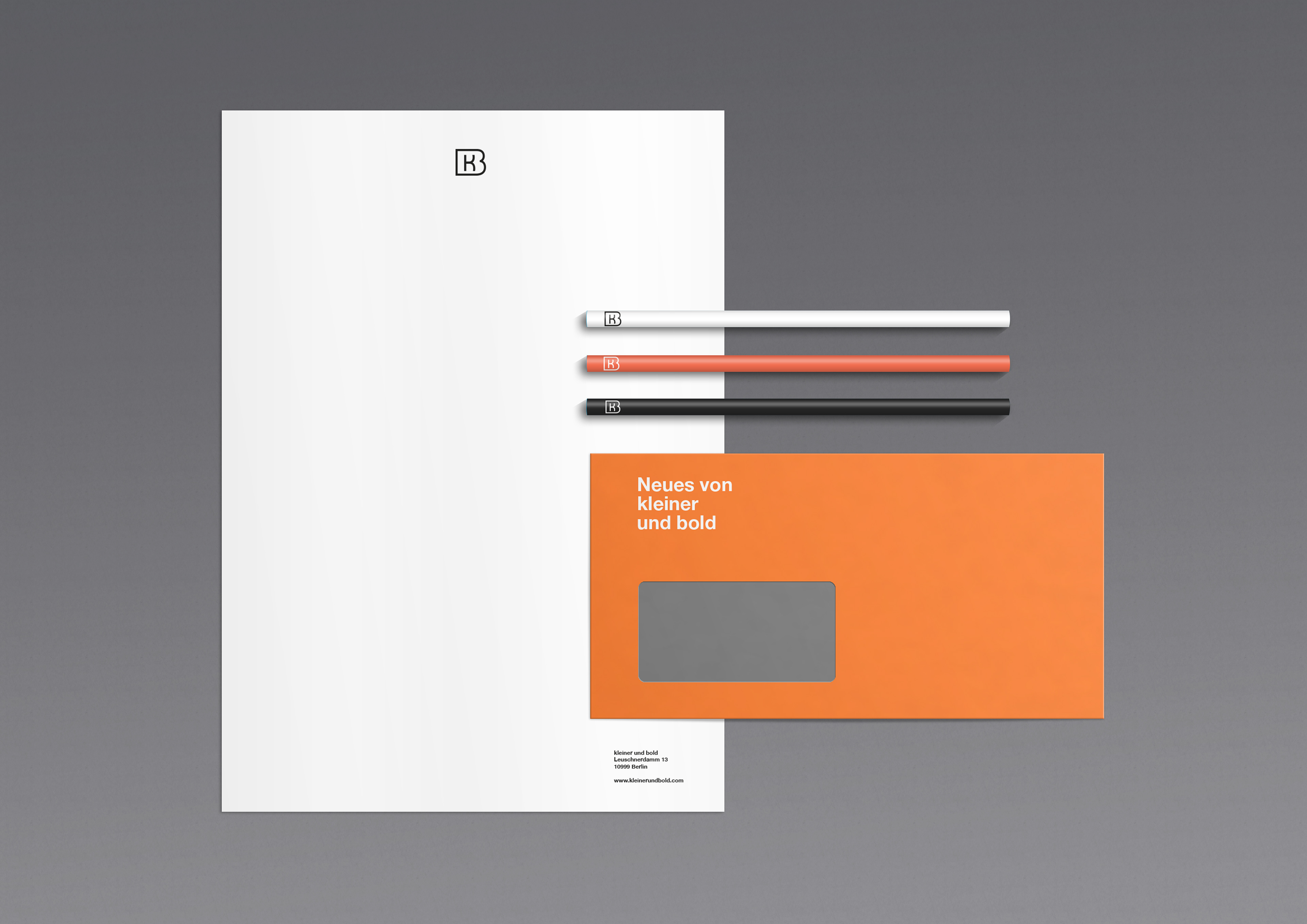
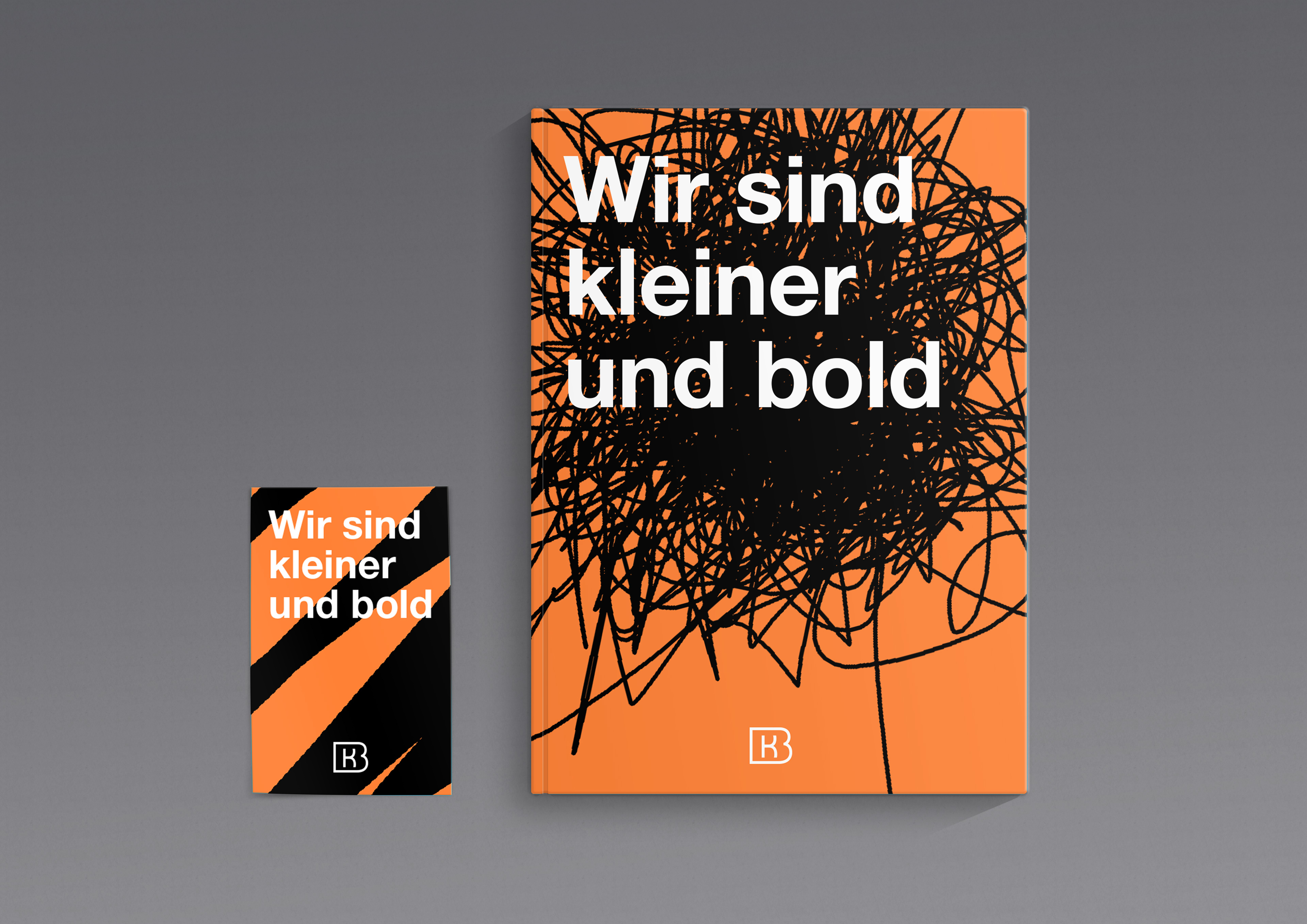
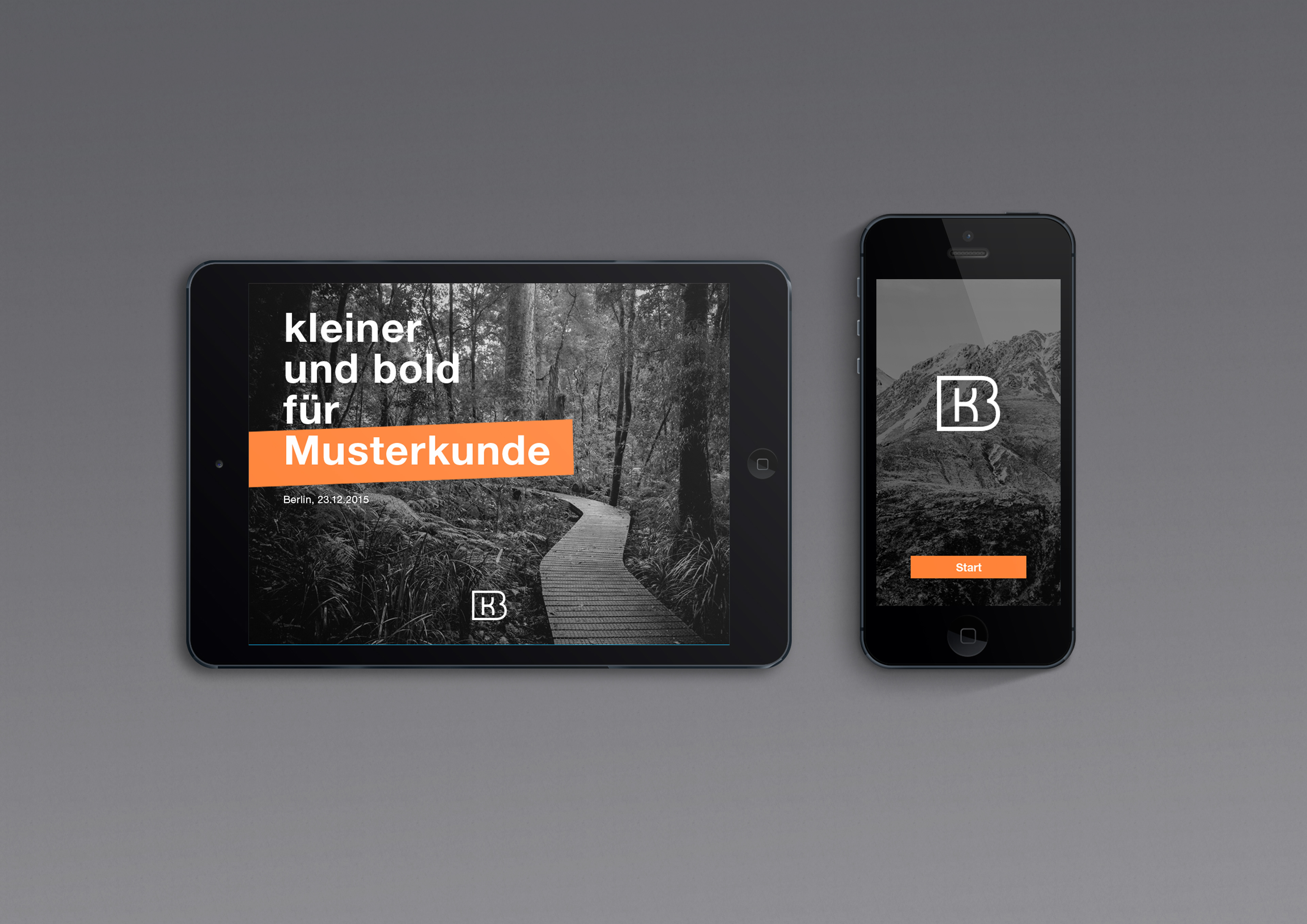
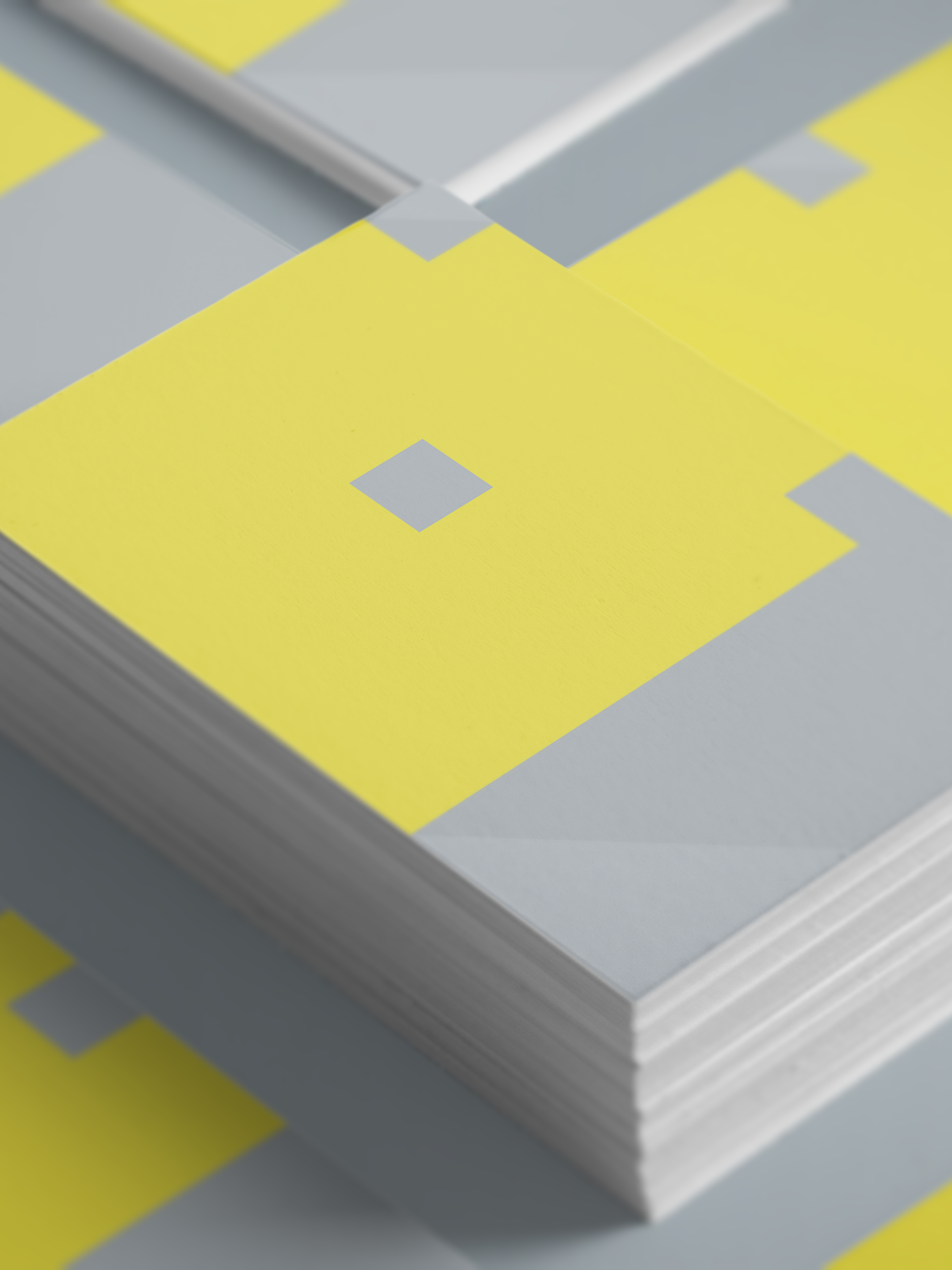
kleiner und bold is a fine Berlin based branding agency. The name derives from the typographic terms “smaller” and “bold”. Based on this I developed a logo with a smaller K embedded in a bold B.
Although this is an unrealized project I still like it a lot. And of course I still like kleiner und bold a lot.